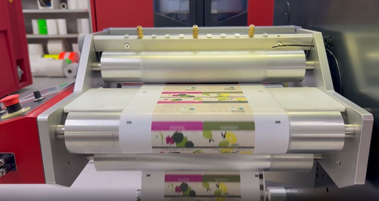
Every now and then, artwork comes through that clearly raises the bar. Not because it’s loud or overworked, but because it’s been carefully considered – fine detail, subtle gradients, deliberate colour choices, and a clear intent behind every element. When that happens, the risk shifts.
The biggest threat to great design isn’t the concept – it’s what happens next.
- If the wrong print process is chosen, fine detail can be lost.
- If colour expectations aren’t managed upfront, the result can disappoint.
- If proofing is rushed, small issues can undermine the work as a whole.
To support high-quality graphics, the process focuses on:
- Selecting print technology that can genuinely handle fine detail and gradients
- Matching resolution and colour capability to the artwork’s demands
- Proofing carefully, not quickly
- Making deliberate decisions that protect the integrity of the design
This takes more time and more restraint – but it’s the only way to ensure the finished label reflects the intent behind the artwork. That’s exactly how we approached PawPrint Chocolate’s labels – a boutique chocolate thoughtfully crafted to complement specific wines.
Great design raises the standard for everyone involved.
Our responsibility is to meet that standard – and make sure nothing is lost between screen and final print.
Watch our video below.