It’s no secret that a well-designed label can influence how consumers perceive a product, and ultimately, how successful it is. Having the right label for your product can help you stand out from the competition and drive sales.
But what goes into creating effective product labels? Custom label printing company Guru Labels provides these 5 tips for creating a label that sells!
Know Your Customer
The first step in creating an effective product label is understanding your target market. Knowing the needs of your customer will help you develop the perfect label for them. At the end of the day, it’s about understanding their buying motives.
Ask yourself – why would a customer buy my product? What’s important to them? What do they want to achieve? How do they want to feel? Buying a product for your child can be quite different to buying one for your business, for instance. Understanding what your customer values will help you create a label that speaks directly to them and entices them to purchase your product.
In some industries, like the vape industry, loud, bright eye-catching graphics and text are critical, but not all products and demographics benefit from this style. Candle and fragrance labels for boutique stores, for example, often feature subtle, refined print messages and branding, opting for a less is more approach, which is very effective with consumers in that market.
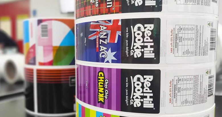
Choose The Right Materials & Adhesives
Next, consider how your labels need to perform. Choosing the right materials and adhesives will ensure that your labels stay put no matter what – regardless of how it’s transported, stored or filled.
Your labels should be able to withstand environmental conditions without fading, curling, peeling off or becoming unreadable over their expected lifetime. Your choice of materials and adhesives will depend on the surface and whether it will be machine or hand applied.
Here are two labels with very different purposes – one is used on a box that will be stored away from light in a warehouse, while the other is used to label a rear window on a vehicle that will be exposed to UV light and outdoor conditions on the daily basis.
Example-1
Example-2

Choose A Layout
Consider what information needs to be on your labels, including any legislative requirements. For example, food labelling requires certain details such as an ingredients list, and a nutrition facts panel.
If you’re selling alcohol for example, then such requirements include alcohol percentage and pregnancy warnings. Layout plays an important role here. How can you create an aesthetic label while including all the necessary information? You should be able to achieve this with the help of a label designer.
Here are two examples of a label light on information, and one that needs to provide a lot more in order to meet legislative requirements.
Example-1
Example-2
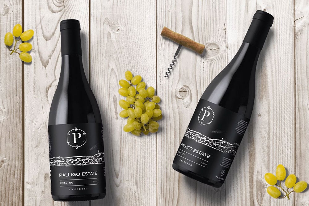
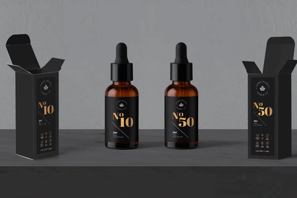
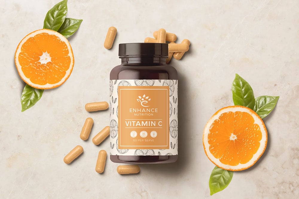
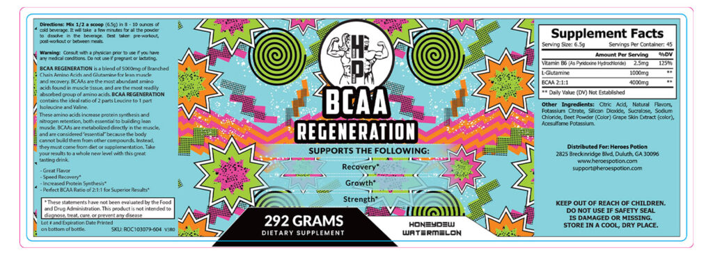
Choose A Font
Depending on how much information you need to display on your label, and how big your label is, will influence your font choice in part. But fonts also helped personify a brand and bring it to life.
Think of it this way – the information on the label is ‘what’ you say, and the font is the tone in which you say it! Certain fonts fit certain demographics, like corporate, natural/earthy, fun/edgy and kid-friendly. There is a large variety of free fonts to choose from, but you can also choose a professionally designed one. While these do cost money, they can help your brand stand out from the crowd. When choosing a label printer, be sure to ask them about their font library.
Take a look at these examples. One is a health supplement, and the other is a pre-workout supplement. They’re actually similar fields but have very different aesthetics.
Example-1
Example-2
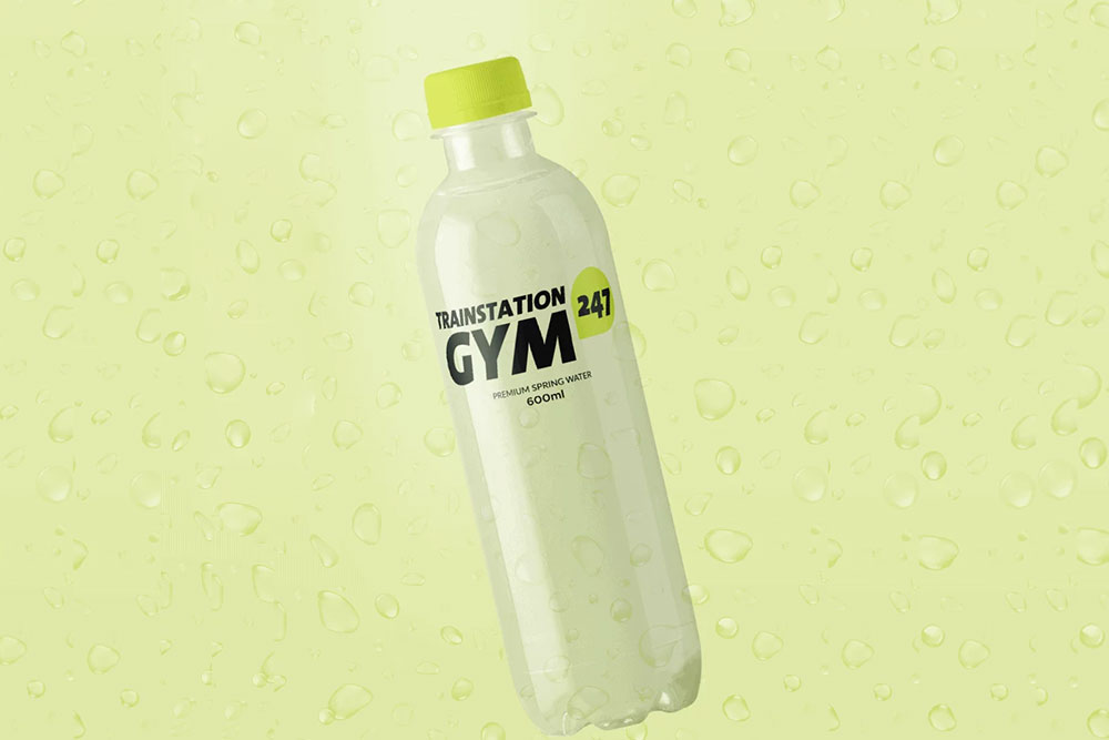
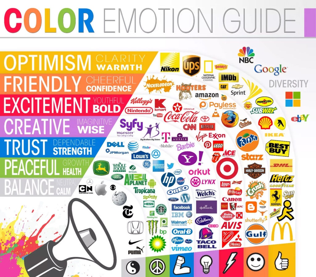
Choose A Colour Palette
As colours have the capability to evoke powerful emotions, they play a crucial role in marketing and branding.
According to various studies, most people base a perception of a product solely on colour. One study estimated this judgement to occur 62% – 90% of the time (Gopikrshna & Kumar, 2015). Let’s consider some well-known brands and their colours. Facebook is blue; trust and dependability; Nickelodeon is orange; friendliness and fun; Coca-Cola is red; youthfulness and excitement.
Given colours shape consumer perception and create emotional connections, ask yourself, how would you like your audience to feel about your brand?
You may even want to combine a couple of different colours to convey an even deeper meaning. Four colours are used by Google. Two are for trust, two are for excitement, one is for warmth, and one is for growth – an interesting formula! Check out this fantastic Colour emotion guide from the Logo Company to learn more about the power of colour to influence emotions.
Other label design tips
- When picking colours try to work from a colour book (Pantone’s Colour Bridge or CMYK book are good choices). These tend to be clean colours. Depending on your screen calibration, picking a colour from your screen without attention to colour values may result in off colours. This will also help with keeping colours consistent across print technologies.
- Reduce clutter. Make sure that you know what the key elements of your label are and make sure they are free from noise, such as busy backgrounds or neighbouring elements that are too close. Don’t be afraid to leave empty spaces to increase readability.
- While designing on screen, don’t forget that your product will most likely first be viewed from a distance. Make sure that there is enough contrast in your design for important visual details to stand out.
- Don’t forget that although you can zoom in on your design, the physical print has a limit on how fine it can get, resulting in lost detail.
- Limit the number of fonts used, two is ideal for most designs. Choose a font that fits the personality of your product. For body copy and finer details, choose a simpler font. You don’t need a super plain font, but legibility at a smaller size is crucial.
Key takeaways
A great looking label has power – it makes people notice and remember your brand while also providing important information about the product itself.
All this combines together into one powerful tool of persuasion. As an owner of a business, having an effective product label is key in increasing brand value and sales. There is quite a bit to creating a powerful label, and some companies continually refine their labels to get the formula just right.
References
Gopikrishna, R., & Kumar, M. (2015). A Conceptual Study on Psychology of Colour in
Marketing and Branding. International Journal of Economic Research, 12(2).